THE LAMBERT CENTER FOR ARTS + IDEAS
ROLE | ART DIRECTION, VISUAL IDENTITY, GRAPHIC DESIGN
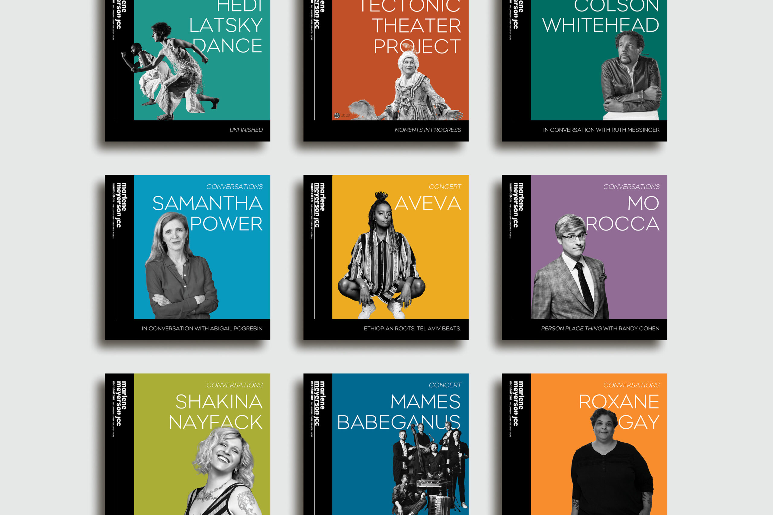
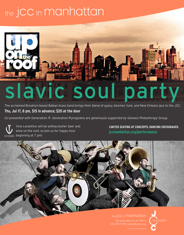
After a major gift naming the JCC Manhattan’s Center for Arts + Ideas, stakeholders wanted a new visual identity for their arts program advertising that pulled everything under one uniform style. Previously, each arts program had a separate look from each other and the organization as a whole. The majority of the JCC’s advertising relies on long form copy, and all of the photography used for advertising is supplied from the performers so there is no uniformity in the images. My goal was to create a system with clear rules for how to treat the issues that arise when you have no control over the quality or content of photography assets, and to unify and elevate the look of the programing in order to contend with competing organizations.
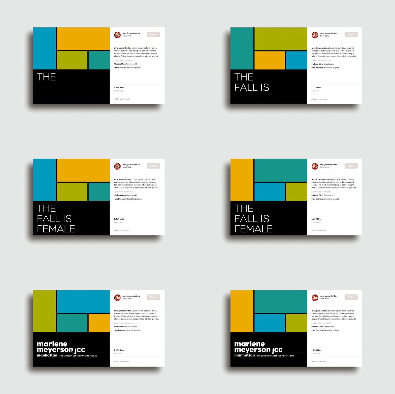
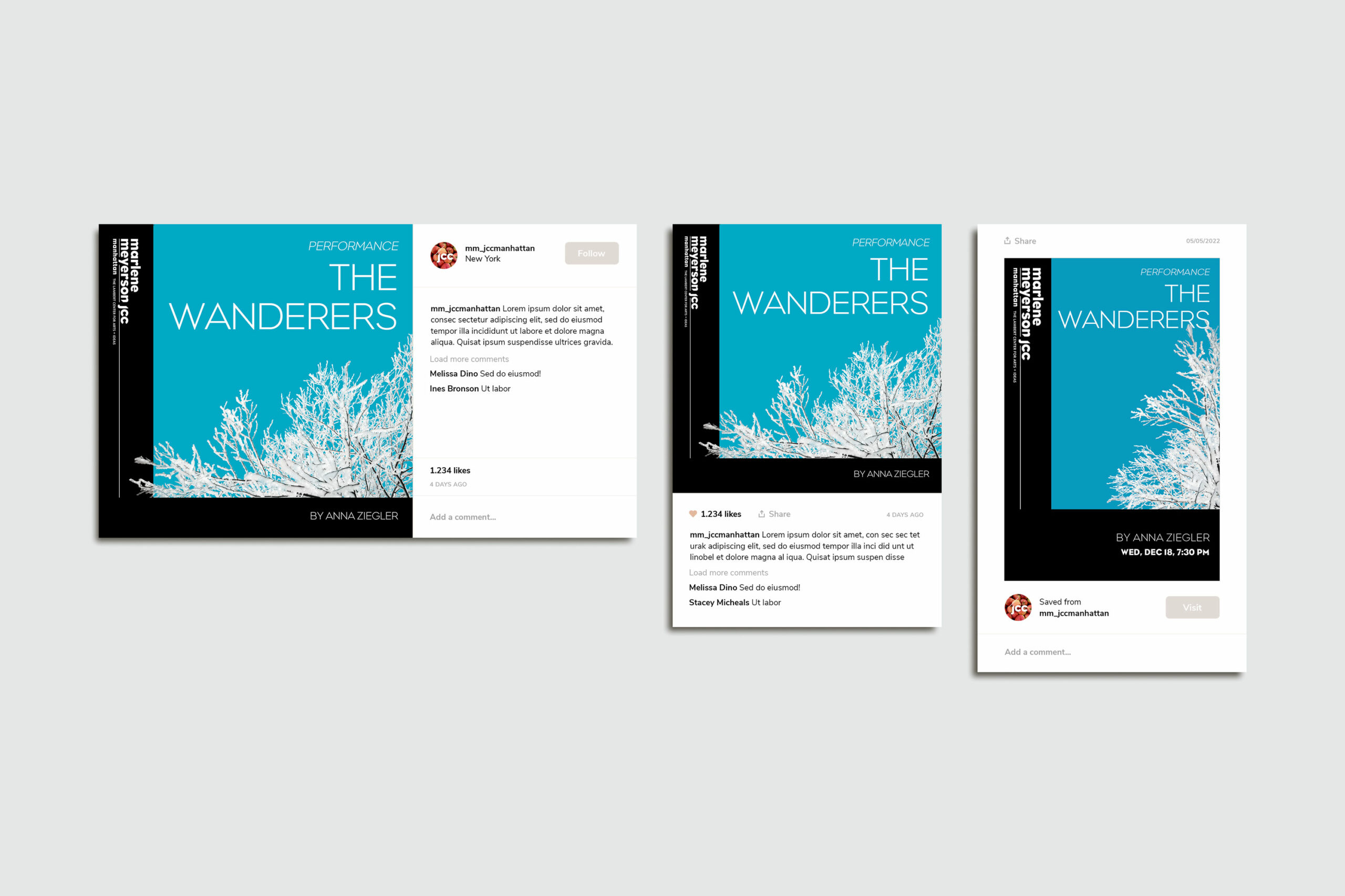
To visually highlight that these are arts related programs, the design was created with a Neoplastic aesthetic, with four complimentary colors chosen from the JCC’s palette that rotate each season. To create uniformity in the images, subjects are removed from the background and set in black and white with boosted contrast and brightness. If no image is available or an image provided is too low resolution to be used, either a stock image that relates to the topic of the program can be used and treated the same way, or the modular blocks can be used together to graphically fill the space and break up the large blocks of text. Black backgrounds with knockout text pull the viewer's focus back to the bright colors behind the images and where the headlines are set.
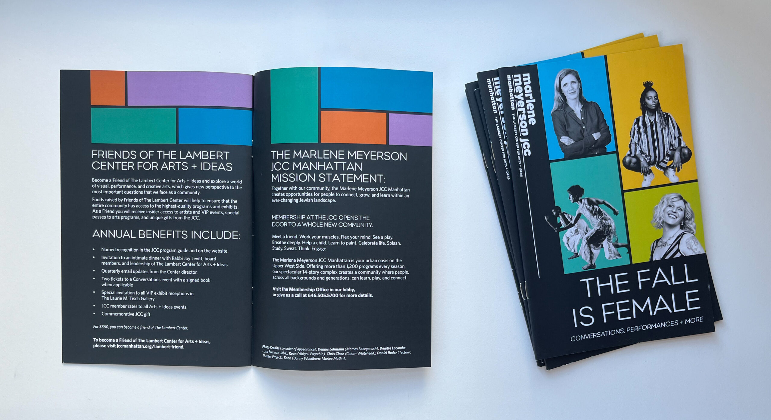
SEASON BROCHURES
SOCIAL MEDIA POSTS
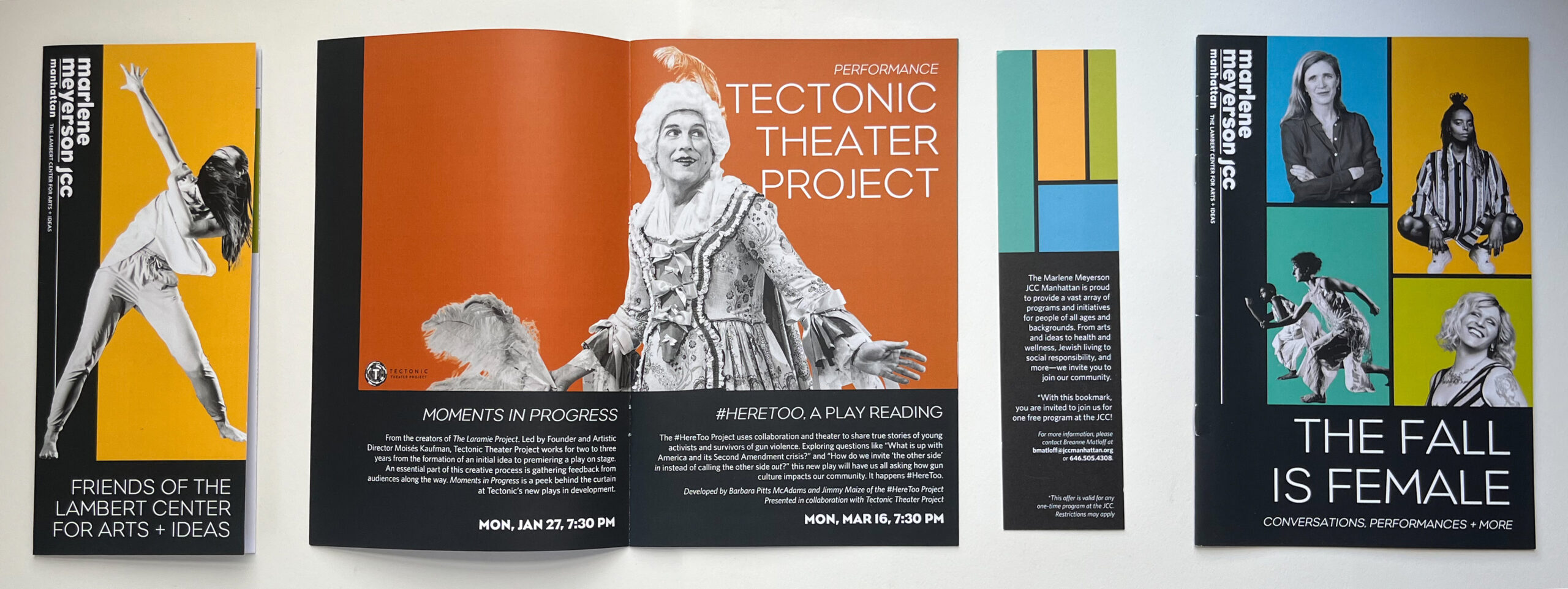
FUNDRAISING PAMPHLET, WINTER 2020 SEASON BROCHURE, PROMOTIONAL BOOKMARK COUPON, FALL 2019 SEASON BROCHURE
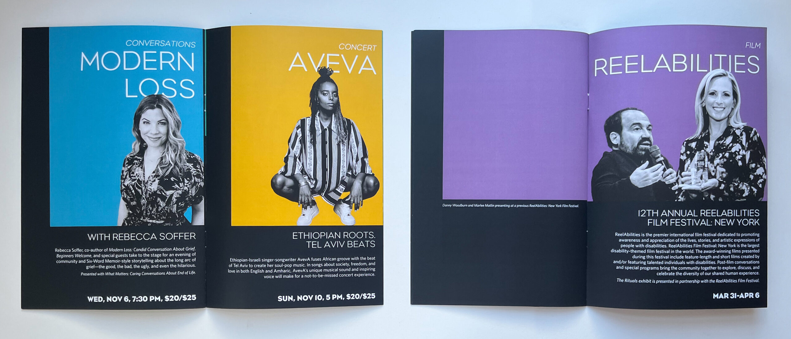
SEASON BROCHURES, INSIDE

FUNDRAISING PAMPHLET
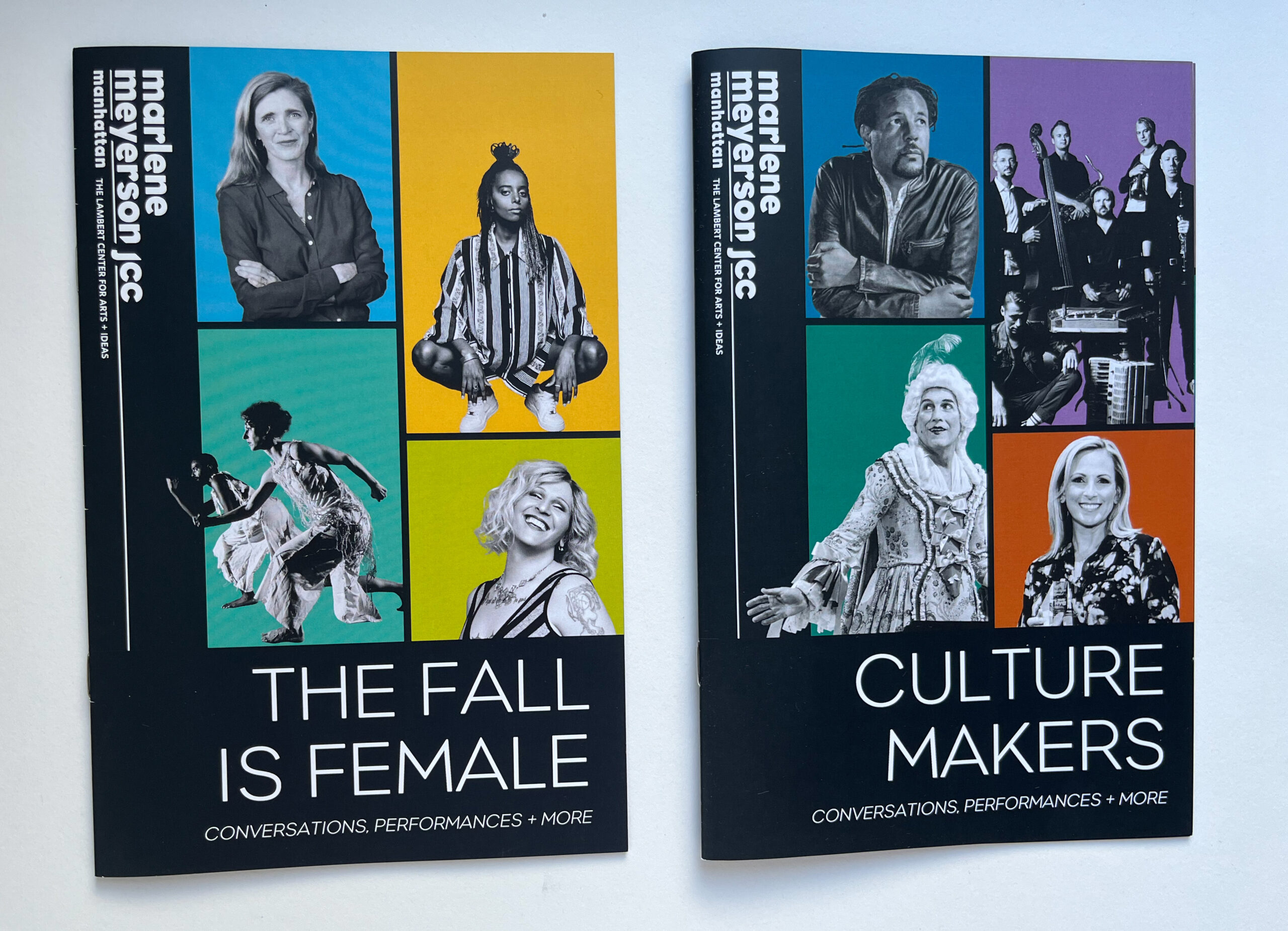
SEASON BROCHURES, COVER
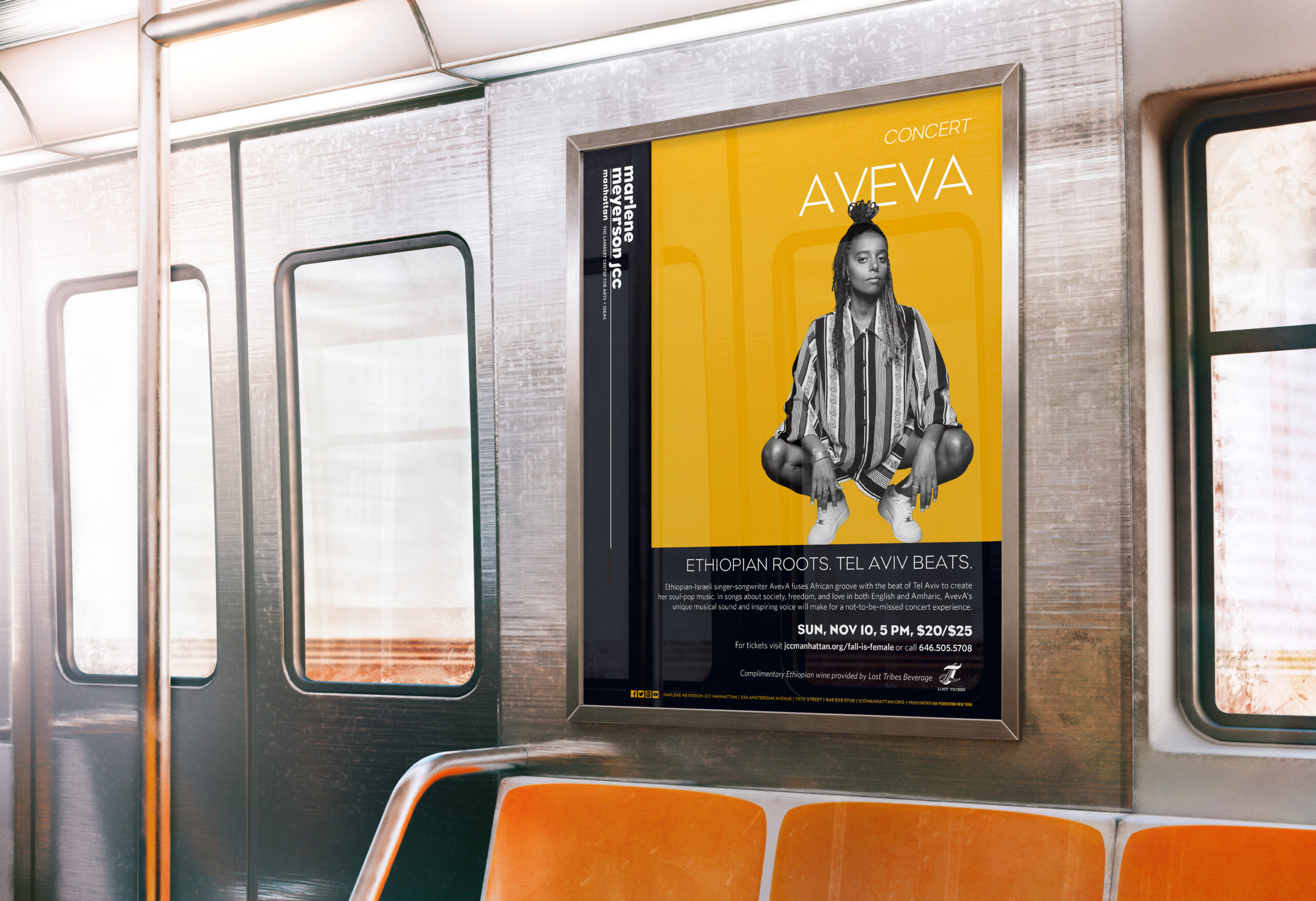
LONG FORM SUBWAY AD CAMPAIGN
BEFORE
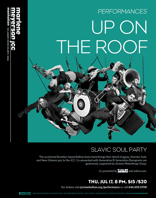
AFTER

